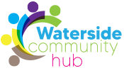
To improve communications and the charity’s online presence, discussions started with website and logo designer Graham Campbell, who was given all the children’s designs from the two logo competitions. The charity’s current website and logo and are the direct result.
Graham’s reasons for the logo are these: it ‘represents a mill, which was in many of the drawings sent in. This doubles up as a community gathering round, with the brown and green representing nature, blue for the water and yellow for the duck race. The purple I have put in for loyalty of the team who are working on this project. (In colour theory purple tends to represent loyalty.)’
